|
EN
|
|
|
Group: Forum Members
Posts: 50,
Visits: 244
|
Hello: I have noticed that the text in <surveypage> /caption gets truncated depending on the screen size so I'm looking for a way to ensure that the text is always displayed in full. (We are planning to run this on Inquisit Web). For instance, in the screenshot attached, the lower half of the last sentence is getting cut (added a red rectangle for emphasis). Depending on the size of the text inside caption, the last few sentences don't get to be displayed at all on my 14-inch macbook (likewise, on a 11-inch ipad). However, when I run the same code using a 24-inch monitor, most of the text is displayed in full. I attached below excerpts of the code that is being used to generate the screen in the attached screenshot (the text under /caption may not display correctly because it is in Japanese...). If you have any suggestions on how tackle this problem, would love to hear. I read in another post about using /text in combination with /stimulusframes but I'm not sure how they could be used to make sure that the text is always displayed in full regardless of screen size. Thank you very much in advance, E. 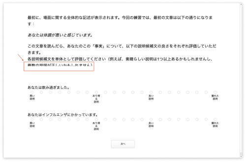 <defaults> / fontstyle = ("Arial", 2.50%, false, false, false, false, 5, 1) / canvassize = (100%,100%) / halign = center </defaults> <surveypage test_stage1> / caption = "最初に、場面に関する全体的な記述が表示されます。今回の練習では、最初の文章は以下の通りになります:<br><br> <i>あなたは体調が悪いと感じています。</i><br><br> この文章を読んだら、あなたのこの「事実」について、以下の説明候補文の良さをそれぞれ評価していただきます。<br> 各説明候補文を単体として評価してください(例えば、素晴らしい説明は1つ以上あるかもしれませんし、複数の説明が正しいかもしれません)。<br><br>" / questions = [1-4=noreplace(test_stat1, test_stat2)] </surveypage> <radiobuttons test_stat1> / caption="あなたはインフルエンザにかかっています。" / options=("悪い~n説明", " ", " ", " ", " ", " ", " ", "あり得る~n説明", " ", " ", " ", " ", " ", "良い~n説明", " ", " ", " ", " ", " ", " ", "優れた~n説明") / optionvalues = ("1", "2", "3", "4","5", "6", "7", "8", "9", "10", "11", "12", "13", "14", "15", "16", "17", "18", "19", "20", "21") / required = true / orientation = horizontalequal </radiobuttons> <radiobuttons test_stat2> / caption="あなたは飲み過ぎました。" / options=("悪い~n説明", " ", " ", " ", " ", " ", " ", "あり得る~n説明", " ", " ", " ", " ", " ", "良い~n説明", " ", " ", " ", " ", " ", " ", "優れた~n説明") / optionvalues = ("1", "2", "3", "4","5", "6", "7", "8", "9", "10", "11", "12", "13", "14", "15", "16", "17", "18", "19", "20", "21") / required = true / orientation = horizontalequal </radiobuttons>
|
|
|
|
|
Dave
|
|
|
Group: Administrators
Posts: 13K,
Visits: 109K
|
+xHello: I have noticed that the text in <surveypage> /caption gets truncated depending on the screen size so I'm looking for a way to ensure that the text is always displayed in full. (We are planning to run this on Inquisit Web). For instance, in the screenshot attached, the lower half of the last sentence is getting cut (added a red rectangle for emphasis). Depending on the size of the text inside caption, the last few sentences don't get to be displayed at all on my 14-inch macbook (likewise, on a 11-inch ipad). However, when I run the same code using a 24-inch monitor, most of the text is displayed in full. I attached below excerpts of the code that is being used to generate the screen in the attached screenshot (the text under /caption may not display correctly because it is in Japanese...). If you have any suggestions on how tackle this problem, would love to hear. I read in another post about using /text in combination with /stimulusframes but I'm not sure how they could be used to make sure that the text is always displayed in full regardless of screen size. Thank you very much in advance, E. <defaults> / fontstyle = ("Arial", 2.50%, false, false, false, false, 5, 1) / canvassize = (100%,100%) / halign = center </defaults> <surveypage test_stage1> / caption = "最初に、場面に関する全体的な記述が表示されます。今回の練習では、最初の文章は以下の通りになります:<br><br> <i>あなたは体調が悪いと感じています。</i><br><br> この文章を読んだら、あなたのこの「事実」について、以下の説明候補文の良さをそれぞれ評価していただきます。<br> 各説明候補文を単体として評価してください(例えば、素晴らしい説明は1つ以上あるかもしれませんし、複数の説明が正しいかもしれません)。<br><br>" / questions = [1-4=noreplace(test_stat1, test_stat2)] </surveypage> <radiobuttons test_stat1> / caption="あなたはインフルエンザにかかっています。" / options=("悪い~n説明", " ", " ", " ", " ", " ", " ", "あり得る~n説明", " ", " ", " ", " ", " ", "良い~n説明", " ", " ", " ", " ", " ", " ", "優れた~n説明") / optionvalues = ("1", "2", "3", "4","5", "6", "7", "8", "9", "10", "11", "12", "13", "14", "15", "16", "17", "18", "19", "20", "21") / required = true / orientation = horizontalequal </radiobuttons> <radiobuttons test_stat2> / caption="あなたは飲み過ぎました。" / options=("悪い~n説明", " ", " ", " ", " ", " ", " ", "あり得る~n説明", " ", " ", " ", " ", " ", "良い~n説明", " ", " ", " ", " ", " ", " ", "優れた~n説明") / optionvalues = ("1", "2", "3", "4","5", "6", "7", "8", "9", "10", "11", "12", "13", "14", "15", "16", "17", "18", "19", "20", "21") / required = true / orientation = horizontalequal </radiobuttons> Layout that works well across a wide array of different devices can be difficult to get right. Things that are useful: (1) Use /canvasaspectratio. https://www.millisecond.com/support/docs/current/html/language/attributes/canvasaspectratio.htm(2) Use <caption> elements instead of a page's /caption. Explicitly /position and /size in percentages as needed. https://www.millisecond.com/support/docs/current/html/language/elements/caption.htm(3) Explicitly size and position any question elements, too, as well as other things like the navigation buttons. https://www.millisecond.com/support/docs/current/html/language/attributes/navigationbuttonsize.htm https://www.millisecond.com/support/docs/current/html/language/attributes/canvasaspectratio.htm(4) Test across as wide a variety of devices as possible and iterate layout improvements.
|
|
|
|
|
Erin2004
|
|
|
Group: Forum Members
Posts: 10,
Visits: 29
|
+x+xHello: I have noticed that the text in <surveypage> /caption gets truncated depending on the screen size so I'm looking for a way to ensure that the text is always displayed in full. (We are planning to run this on Inquisit Web). For instance, in the screenshot attached, the lower half of the last sentence is getting cut (added a red rectangle for emphasis). Depending on the size of the text inside caption, the last few sentences don't get to be displayed at all on my 14-inch macbook (likewise, on a 11-inch ipad). However, when I run the same code using a 24-inch monitor, most of the text is displayed in full. I attached below excerpts of the code that is being used to generate the screen in the attached screenshot (the text under /caption may not display correctly because it is in Japanese...). If you have any suggestions on how tackle this problem, would love to hear. I read in another post about using /text in combination with /stimulusframes but I'm not sure how they could be used to make sure that the text is always displayed in full regardless of screen size. Thank you very much in advance, E. <defaults> / fontstyle = ("Arial", 2.50%, false, false, false, false, 5, 1) / canvassize = (100%,100%) / halign = center </defaults> <surveypage test_stage1> / caption = "最初に、場面に関する全体的な記述が表示されます。今回の練習では、最初の文章は以下の通りになります:<br><br> <i>あなたは体調が悪いと感じています。</i><br><br> この文章を読んだら、あなたのこの「事実」について、以下の説明候補文の良さをそれぞれ評価していただきます。<br> 各説明候補文を単体として評価してください(例えば、素晴らしい説明は1つ以上あるかもしれませんし、複数の説明が正しいかもしれません)。<br><br>" / questions = [1-4=noreplace(test_stat1, test_stat2)] </surveypage> <radiobuttons test_stat1> / caption="あなたはインフルエンザにかかっています。" / options=("悪い~n説明", " ", " ", " ", " ", " ", " ", "あり得る~n説明", " ", " ", " ", " ", " ", "良い~n説明", " ", " ", " ", " ", " ", " ", "優れた~n説明") / optionvalues = ("1", "2", "3", "4","5", "6", "7", "8", "9", "10", "11", "12", "13", "14", "15", "16", "17", "18", "19", "20", "21") / required = true / orientation = horizontalequal </radiobuttons> <radiobuttons test_stat2> / caption="あなたは飲み過ぎました。" / options=("悪い~n説明", " ", " ", " ", " ", " ", " ", "あり得る~n説明", " ", " ", " ", " ", " ", "良い~n説明", " ", " ", " ", " ", " ", " ", "優れた~n説明") / optionvalues = ("1", "2", "3", "4","5", "6", "7", "8", "9", "10", "11", "12", "13", "14", "15", "16", "17", "18", "19", "20", "21") / required = true / orientation = horizontalequal </radiobuttons> Layout that works well across a wide array of different devices can be difficult to get right. Things that are useful: (1) Use /canvasaspectratio. https://www.millisecond.com/support/docs/current/html/language/attributes/canvasaspectratio.htm(2) Use <caption> elements instead of a page's /caption. Explicitly /position and /size in percentages as needed. https://www.millisecond.com/support/docs/current/html/language/elements/caption.htm(3) Explicitly size and position any question elements, too, as well as other things like the navigation buttons. https://www.millisecond.com/support/docs/current/html/language/attributes/navigationbuttonsize.htm https://www.millisecond.com/support/docs/current/html/language/attributes/canvasaspectratio.htm(4) Test across as wide a variety of devices as possible and iterate layout improvements. I think I’ve encountered something similar, but with images instead of text. Just in case there have been any updates, I’m asking again. I have three images on one page. The layout looks great on my MacBook Air during testing. However, my co-author mentioned that when testing on a larger screen, there’s a lot of space between each image. I believe most of our participants won’t have huge screens, so it should be fine. But out of curiosity, does Inquisit have a way to position and adjust images based on screen pixel percentages rather than absolute values? That would help us achieve more consistent layouts. Thanks! 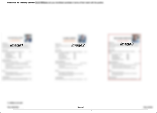
|
|
|
|
|
Dave
|
|
|
Group: Administrators
Posts: 13K,
Visits: 109K
|
+x+x+xHello: I have noticed that the text in <surveypage> /caption gets truncated depending on the screen size so I'm looking for a way to ensure that the text is always displayed in full. (We are planning to run this on Inquisit Web). For instance, in the screenshot attached, the lower half of the last sentence is getting cut (added a red rectangle for emphasis). Depending on the size of the text inside caption, the last few sentences don't get to be displayed at all on my 14-inch macbook (likewise, on a 11-inch ipad). However, when I run the same code using a 24-inch monitor, most of the text is displayed in full. I attached below excerpts of the code that is being used to generate the screen in the attached screenshot (the text under /caption may not display correctly because it is in Japanese...). If you have any suggestions on how tackle this problem, would love to hear. I read in another post about using /text in combination with /stimulusframes but I'm not sure how they could be used to make sure that the text is always displayed in full regardless of screen size. Thank you very much in advance, E. <defaults> / fontstyle = ("Arial", 2.50%, false, false, false, false, 5, 1) / canvassize = (100%,100%) / halign = center </defaults> <surveypage test_stage1> / caption = "最初に、場面に関する全体的な記述が表示されます。今回の練習では、最初の文章は以下の通りになります:<br><br> <i>あなたは体調が悪いと感じています。</i><br><br> この文章を読んだら、あなたのこの「事実」について、以下の説明候補文の良さをそれぞれ評価していただきます。<br> 各説明候補文を単体として評価してください(例えば、素晴らしい説明は1つ以上あるかもしれませんし、複数の説明が正しいかもしれません)。<br><br>" / questions = [1-4=noreplace(test_stat1, test_stat2)] </surveypage> <radiobuttons test_stat1> / caption="あなたはインフルエンザにかかっています。" / options=("悪い~n説明", " ", " ", " ", " ", " ", " ", "あり得る~n説明", " ", " ", " ", " ", " ", "良い~n説明", " ", " ", " ", " ", " ", " ", "優れた~n説明") / optionvalues = ("1", "2", "3", "4","5", "6", "7", "8", "9", "10", "11", "12", "13", "14", "15", "16", "17", "18", "19", "20", "21") / required = true / orientation = horizontalequal </radiobuttons> <radiobuttons test_stat2> / caption="あなたは飲み過ぎました。" / options=("悪い~n説明", " ", " ", " ", " ", " ", " ", "あり得る~n説明", " ", " ", " ", " ", " ", "良い~n説明", " ", " ", " ", " ", " ", " ", "優れた~n説明") / optionvalues = ("1", "2", "3", "4","5", "6", "7", "8", "9", "10", "11", "12", "13", "14", "15", "16", "17", "18", "19", "20", "21") / required = true / orientation = horizontalequal </radiobuttons> Layout that works well across a wide array of different devices can be difficult to get right. Things that are useful: (1) Use /canvasaspectratio. https://www.millisecond.com/support/docs/current/html/language/attributes/canvasaspectratio.htm(2) Use <caption> elements instead of a page's /caption. Explicitly /position and /size in percentages as needed. https://www.millisecond.com/support/docs/current/html/language/elements/caption.htm(3) Explicitly size and position any question elements, too, as well as other things like the navigation buttons. https://www.millisecond.com/support/docs/current/html/language/attributes/navigationbuttonsize.htm https://www.millisecond.com/support/docs/current/html/language/attributes/canvasaspectratio.htm(4) Test across as wide a variety of devices as possible and iterate layout improvements. I think I’ve encountered something similar, but with images instead of text. Just in case there have been any updates, I’m asking again. I have three images on one page. The layout looks great on my MacBook Air during testing. However, my co-author mentioned that when testing on a larger screen, there’s a lot of space between each image. I believe most of our participants won’t have huge screens, so it should be fine. But out of curiosity, does Inquisit have a way to position and adjust images based on screen pixel percentages rather than absolute values? That would help us achieve more consistent layouts. Thanks! All size and position attributes accept and default to screen percentages. I'm not sure what you mean by "screen pixel percentages." For consistency across different screen aspect ratios, make use of /canvasaspectratio.
|
|
|
|
|
Erin2004
|
|
|
Group: Forum Members
Posts: 10,
Visits: 29
|
+x+x+x+xHello: I have noticed that the text in <surveypage> /caption gets truncated depending on the screen size so I'm looking for a way to ensure that the text is always displayed in full. (We are planning to run this on Inquisit Web). For instance, in the screenshot attached, the lower half of the last sentence is getting cut (added a red rectangle for emphasis). Depending on the size of the text inside caption, the last few sentences don't get to be displayed at all on my 14-inch macbook (likewise, on a 11-inch ipad). However, when I run the same code using a 24-inch monitor, most of the text is displayed in full. I attached below excerpts of the code that is being used to generate the screen in the attached screenshot (the text under /caption may not display correctly because it is in Japanese...). If you have any suggestions on how tackle this problem, would love to hear. I read in another post about using /text in combination with /stimulusframes but I'm not sure how they could be used to make sure that the text is always displayed in full regardless of screen size. Thank you very much in advance, E. <defaults> / fontstyle = ("Arial", 2.50%, false, false, false, false, 5, 1) / canvassize = (100%,100%) / halign = center </defaults> <surveypage test_stage1> / caption = "最初に、場面に関する全体的な記述が表示されます。今回の練習では、最初の文章は以下の通りになります:<br><br> <i>あなたは体調が悪いと感じています。</i><br><br> この文章を読んだら、あなたのこの「事実」について、以下の説明候補文の良さをそれぞれ評価していただきます。<br> 各説明候補文を単体として評価してください(例えば、素晴らしい説明は1つ以上あるかもしれませんし、複数の説明が正しいかもしれません)。<br><br>" / questions = [1-4=noreplace(test_stat1, test_stat2)] </surveypage> <radiobuttons test_stat1> / caption="あなたはインフルエンザにかかっています。" / options=("悪い~n説明", " ", " ", " ", " ", " ", " ", "あり得る~n説明", " ", " ", " ", " ", " ", "良い~n説明", " ", " ", " ", " ", " ", " ", "優れた~n説明") / optionvalues = ("1", "2", "3", "4","5", "6", "7", "8", "9", "10", "11", "12", "13", "14", "15", "16", "17", "18", "19", "20", "21") / required = true / orientation = horizontalequal </radiobuttons> <radiobuttons test_stat2> / caption="あなたは飲み過ぎました。" / options=("悪い~n説明", " ", " ", " ", " ", " ", " ", "あり得る~n説明", " ", " ", " ", " ", " ", "良い~n説明", " ", " ", " ", " ", " ", " ", "優れた~n説明") / optionvalues = ("1", "2", "3", "4","5", "6", "7", "8", "9", "10", "11", "12", "13", "14", "15", "16", "17", "18", "19", "20", "21") / required = true / orientation = horizontalequal </radiobuttons> Layout that works well across a wide array of different devices can be difficult to get right. Things that are useful: (1) Use /canvasaspectratio. https://www.millisecond.com/support/docs/current/html/language/attributes/canvasaspectratio.htm(2) Use <caption> elements instead of a page's /caption. Explicitly /position and /size in percentages as needed. https://www.millisecond.com/support/docs/current/html/language/elements/caption.htm(3) Explicitly size and position any question elements, too, as well as other things like the navigation buttons. https://www.millisecond.com/support/docs/current/html/language/attributes/navigationbuttonsize.htm https://www.millisecond.com/support/docs/current/html/language/attributes/canvasaspectratio.htm(4) Test across as wide a variety of devices as possible and iterate layout improvements. I think I’ve encountered something similar, but with images instead of text. Just in case there have been any updates, I’m asking again. I have three images on one page. The layout looks great on my MacBook Air during testing. However, my co-author mentioned that when testing on a larger screen, there’s a lot of space between each image. I believe most of our participants won’t have huge screens, so it should be fine. But out of curiosity, does Inquisit have a way to position and adjust images based on screen pixel percentages rather than absolute values? That would help us achieve more consistent layouts. Thanks! All size and position attributes accept and default to screen percentages. I'm not sure what you mean by "screen pixel percentages." For consistency across different screen aspect ratios, make use of /canvasaspectratio. On different screens (Screen 1 is a MacBook Air, and Screen 2 is a much larger screen), the layout appears differently. Screen 1 layout is what we want. I’ve attached screenshots and my code below.  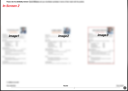 <picture 1> / items = ("1.png") / vposition = 55% / hposition = 49% / size = (600, 600) </picture> <picture 2> / items = ("2.png") / vposition = 55% / hposition = 16% / size = (600, 600) </picture> <picture 3> / items = ("3.png") / vposition = 55% / hposition = 82% / size = (600, 600) </picture>
|
|
|
|
|
Dave
|
|
|
Group: Administrators
Posts: 13K,
Visits: 109K
|
+x+x+x+x+xHello: I have noticed that the text in <surveypage> /caption gets truncated depending on the screen size so I'm looking for a way to ensure that the text is always displayed in full. (We are planning to run this on Inquisit Web). For instance, in the screenshot attached, the lower half of the last sentence is getting cut (added a red rectangle for emphasis). Depending on the size of the text inside caption, the last few sentences don't get to be displayed at all on my 14-inch macbook (likewise, on a 11-inch ipad). However, when I run the same code using a 24-inch monitor, most of the text is displayed in full. I attached below excerpts of the code that is being used to generate the screen in the attached screenshot (the text under /caption may not display correctly because it is in Japanese...). If you have any suggestions on how tackle this problem, would love to hear. I read in another post about using /text in combination with /stimulusframes but I'm not sure how they could be used to make sure that the text is always displayed in full regardless of screen size. Thank you very much in advance, E. <defaults> / fontstyle = ("Arial", 2.50%, false, false, false, false, 5, 1) / canvassize = (100%,100%) / halign = center </defaults> <surveypage test_stage1> / caption = "最初に、場面に関する全体的な記述が表示されます。今回の練習では、最初の文章は以下の通りになります:<br><br> <i>あなたは体調が悪いと感じています。</i><br><br> この文章を読んだら、あなたのこの「事実」について、以下の説明候補文の良さをそれぞれ評価していただきます。<br> 各説明候補文を単体として評価してください(例えば、素晴らしい説明は1つ以上あるかもしれませんし、複数の説明が正しいかもしれません)。<br><br>" / questions = [1-4=noreplace(test_stat1, test_stat2)] </surveypage> <radiobuttons test_stat1> / caption="あなたはインフルエンザにかかっています。" / options=("悪い~n説明", " ", " ", " ", " ", " ", " ", "あり得る~n説明", " ", " ", " ", " ", " ", "良い~n説明", " ", " ", " ", " ", " ", " ", "優れた~n説明") / optionvalues = ("1", "2", "3", "4","5", "6", "7", "8", "9", "10", "11", "12", "13", "14", "15", "16", "17", "18", "19", "20", "21") / required = true / orientation = horizontalequal </radiobuttons> <radiobuttons test_stat2> / caption="あなたは飲み過ぎました。" / options=("悪い~n説明", " ", " ", " ", " ", " ", " ", "あり得る~n説明", " ", " ", " ", " ", " ", "良い~n説明", " ", " ", " ", " ", " ", " ", "優れた~n説明") / optionvalues = ("1", "2", "3", "4","5", "6", "7", "8", "9", "10", "11", "12", "13", "14", "15", "16", "17", "18", "19", "20", "21") / required = true / orientation = horizontalequal </radiobuttons> Layout that works well across a wide array of different devices can be difficult to get right. Things that are useful: (1) Use /canvasaspectratio. https://www.millisecond.com/support/docs/current/html/language/attributes/canvasaspectratio.htm(2) Use <caption> elements instead of a page's /caption. Explicitly /position and /size in percentages as needed. https://www.millisecond.com/support/docs/current/html/language/elements/caption.htm(3) Explicitly size and position any question elements, too, as well as other things like the navigation buttons. https://www.millisecond.com/support/docs/current/html/language/attributes/navigationbuttonsize.htm https://www.millisecond.com/support/docs/current/html/language/attributes/canvasaspectratio.htm(4) Test across as wide a variety of devices as possible and iterate layout improvements. I think I’ve encountered something similar, but with images instead of text. Just in case there have been any updates, I’m asking again. I have three images on one page. The layout looks great on my MacBook Air during testing. However, my co-author mentioned that when testing on a larger screen, there’s a lot of space between each image. I believe most of our participants won’t have huge screens, so it should be fine. But out of curiosity, does Inquisit have a way to position and adjust images based on screen pixel percentages rather than absolute values? That would help us achieve more consistent layouts. Thanks! All size and position attributes accept and default to screen percentages. I'm not sure what you mean by "screen pixel percentages." For consistency across different screen aspect ratios, make use of /canvasaspectratio. On different screens (Screen 1 is a MacBook Air, and Screen 2 is a much larger screen), the layout appears differently. Screen 1 layout is what we want. I’ve attached screenshots and my code below. <picture 1> / items = ("1.png") / vposition = 55% / hposition = 49% / size = (600, 600) </picture> <picture 2> / items = ("2.png") / vposition = 55% / hposition = 16% / size = (600, 600) </picture> <picture 3> / items = ("3.png") / vposition = 55% / hposition = 82% / size = (600, 600) </picture> If you want the size of the images to be scaled as percentages, then you should tell the attribute so: E.g. /size = (25%, 25%) Note that the images' inherent aspect ratio will always be preserved, Inquisit will not stretch or squeeze images.
|
|
|
|